10 Cozy Color Palettes for Adult Coloring Pages (+ Free Printable)
Discover beautiful cozy color combinations that can completely change the mood of a coloring page. From warm cottagecore tones to calming pastel palettes, these relaxing coloring ideas are perfect for stress relief, anxiety relief, and peaceful creative moments.

Why Color Palettes Matter in Adult Coloring
The colors you choose can completely transform the emotional feeling of a coloring page. A single cozy illustration can feel warm, dreamy, calming, nostalgic, or magical simply by changing the palette.
Many adults use relaxing coloring pages as a way to slow down after stressful days, reduce mental overload, and create peaceful moments away from constant stimulation. Soft color combinations may also help create a comforting atmosphere that encourages mindfulness and calm focus.
Whether you enjoy cottagecore aesthetics, warm autumn tones, pastel palettes, or calming rainy-day colors, experimenting with different color combinations can make coloring feel fresh and inspiring again. If you are building a relaxing coloring routine, you may also enjoy our guides to mindfulness coloring for adults, coloring techniques for stress and anxiety, and relaxing coloring pages for adults.
How Different Color Palettes Change the Same Coloring Page
One of the most relaxing parts of coloring is discovering how the same illustration can tell completely different visual stories depending on the colors you use.
Warm earthy tones may create a cozy autumn feeling, while soft pastel shades can make the exact same drawing feel peaceful and dreamy. Darker palettes may create a rainy-night atmosphere, while brighter combinations feel playful and cheerful.
Below you will find 10 relaxing cozy color palettes for adult coloring pages that work beautifully with cottagecore scenes, cozy animals, rainy window illustrations, warm interiors, floral pages, and relaxing stress relief coloring books. For more theme inspiration, see our 25 cozy coloring page ideas for adults.
Color Psychology in Cozy Coloring Pages
Colors can influence how a coloring page feels emotionally. While coloring is a creative activity, many people naturally associate certain colors with specific moods.
Warm earth tones often feel comforting and nostalgic. Soft blues can feel peaceful and calming. Lavender shades may create a dreamy atmosphere, while muted greens are frequently associated with nature and relaxation.
Understanding basic color psychology can help you create coloring pages that feel even more relaxing and enjoyable.
How to Choose the Perfect Color Palette for Adult Coloring Pages
Choosing a color palette before you start coloring can dramatically improve the final result. Instead of selecting random colors, many experienced colorists begin with a specific mood or atmosphere they want to create.
Warm browns, creams, and soft oranges often create cozy autumn feelings. Pastel pinks and lavender shades can produce dreamy cottagecore scenes, while muted blues and grays work beautifully for rainy-day coloring pages.
When working with adult coloring books, limiting yourself to five or six main colors often creates a more cohesive and professional-looking finished page.
Best Color Palettes for Different Cozy Coloring Themes
Different coloring themes often benefit from different color families. Choosing a palette that matches the mood of the illustration can make the finished page feel more cohesive, immersive, and visually satisfying.
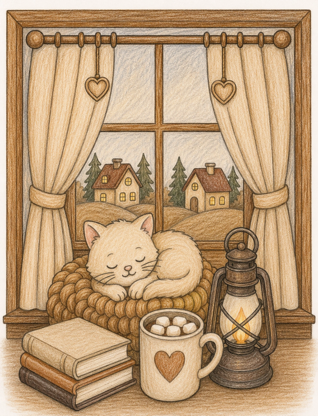
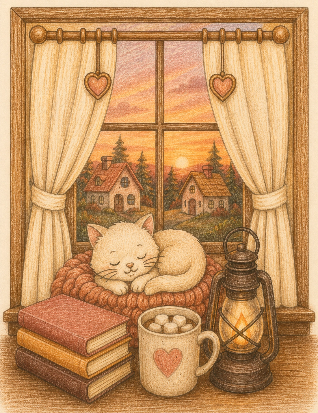
Cozy Cat Coloring Pages
Warm coffee tones, creamy beige shades, caramel accents, and soft browns help create cozy indoor scenes filled with books, blankets, mugs, and sleeping cats.
Cottagecore Coloring Pages
Muted greens, dusty pinks, soft cream colors, and natural browns create the nostalgic countryside atmosphere that defines the cottagecore aesthetic.
Autumn Coloring Pages
Pumpkin orange, golden yellow, chestnut brown, and deep red shades instantly create warmth, nostalgia, and the feeling of a cozy fall day.
Book Lover Coloring Pages
Vintage browns, antique cream tones, dark greens, and candlelight colors work beautifully for reading nooks, libraries, and cozy book-themed illustrations.
Best Art Supplies for Cozy Coloring Palettes
Cozy color palettes work beautifully with alcohol markers, colored pencils, gel pens, and soft pastel tools. Layering warm tones and muted shades can help create a softer and more relaxing visual atmosphere.
Many coloring enthusiasts enjoy combining pastel markers with colored pencils to create cozy depth while keeping the artwork soft and calming. This style works especially well for cottagecore coloring pages and relaxing stress relief illustrations.
10 Cozy Color Palettes for Adult Coloring Pages (+ Free Printable)
Discover soft, warm, and calming color palettes designed to make your cozy coloring pages feel more peaceful, inviting, and beautifully finished.
Cozy Coffee
Warm browns, creamy neutrals, and soft beige tones that create the feeling of a quiet coffee break. Use this palette for mugs, blankets, wooden furniture, books, and cozy indoor scenes.
Color Palette
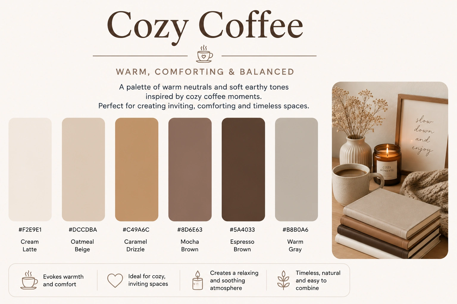
Palette Applied
Cozy Sunset
Golden oranges, peach tones, and warm browns inspired by sunset light. This palette works beautifully for windows, glowing skies, cushions, candles, and peaceful evening coloring pages.
Color Palette
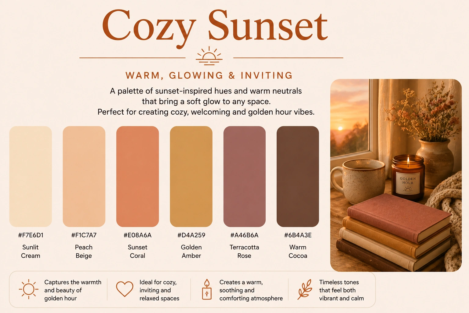
Palette Applied
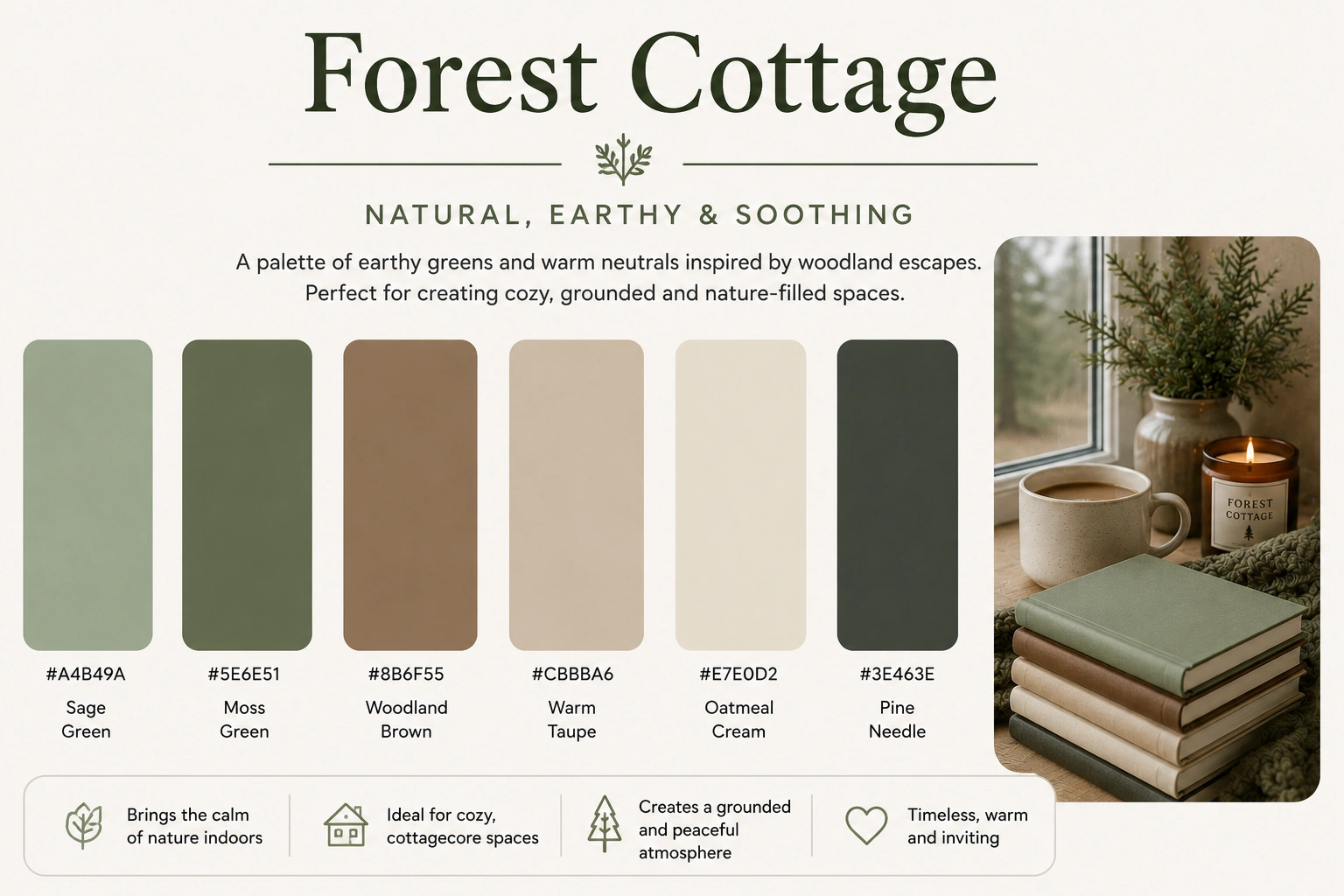
Forest Cottage
Earthy greens, soft browns, and natural neutral shades that bring a calm forest cottage mood. Use it for plants, outdoor views, cozy cabins, books, blankets, and nature-inspired details.
Color Palette
Palette Applied
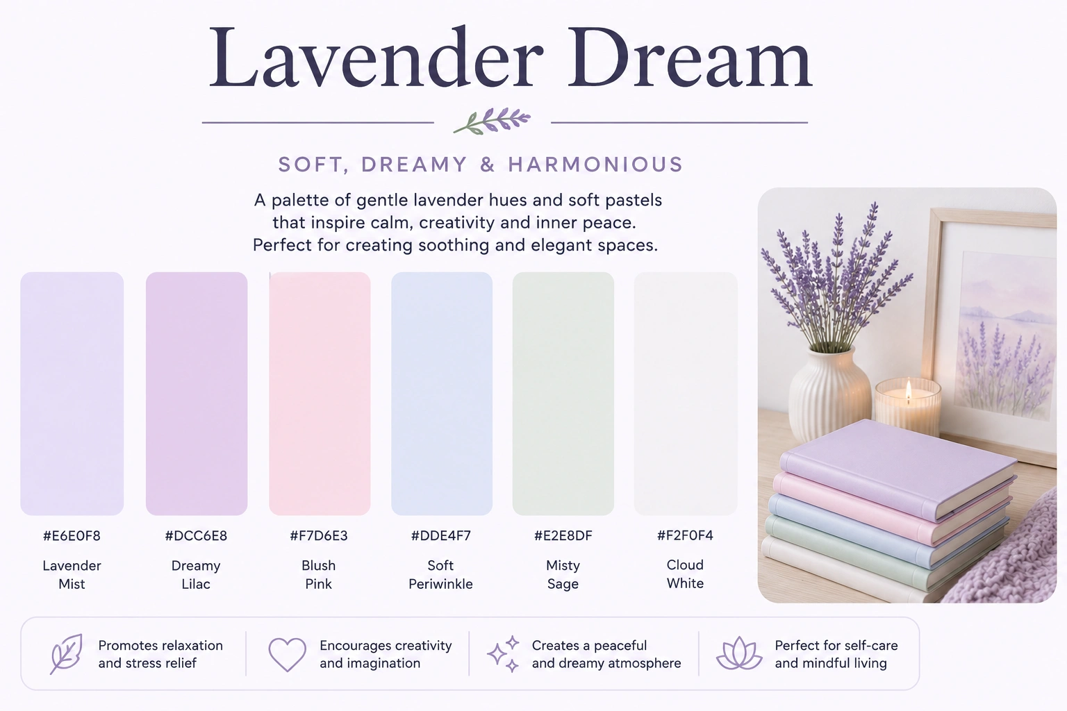
Lavender Dream
Gentle lavender, lilac, blush pink, and soft gray tones for a dreamy relaxing effect. Perfect for curtains, pillows, flowers, journals, calm backgrounds, and quiet nighttime scenes.
Color Palette
Palette Applied
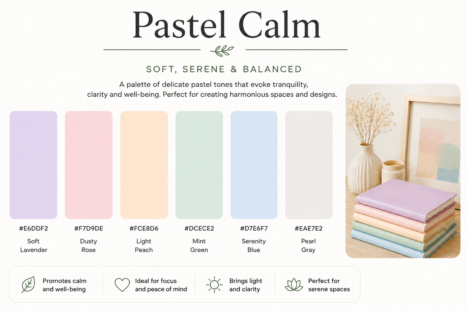
Pastel Calm
Soft pastel pinks, creams, pale blues, and gentle neutrals that create a peaceful and delicate look. Use this palette when you want a light, sweet, airy, and soothing coloring page.
Color Palette
Palette Applied
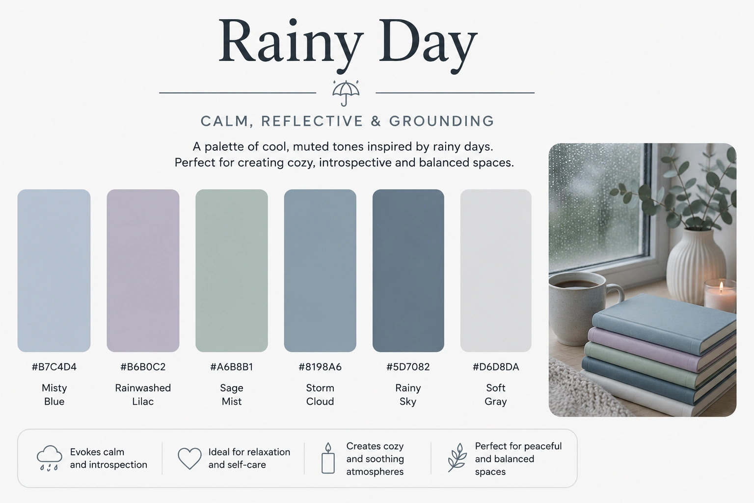
Rainy Day
Cool blues, muted grays, and soft rainy tones that feel calm and introspective. This palette is ideal for rainy windows, cozy blankets, mugs, books, moonlight, and quiet indoor moments.
Color Palette
Palette Applied
Soft Cottagecore
Creamy beige, dusty pink, muted green, and soft natural browns for a gentle countryside feeling. Use it for cottagecore scenes, flowers, blankets, baskets, curtains, and cozy vintage details.
Color Palette
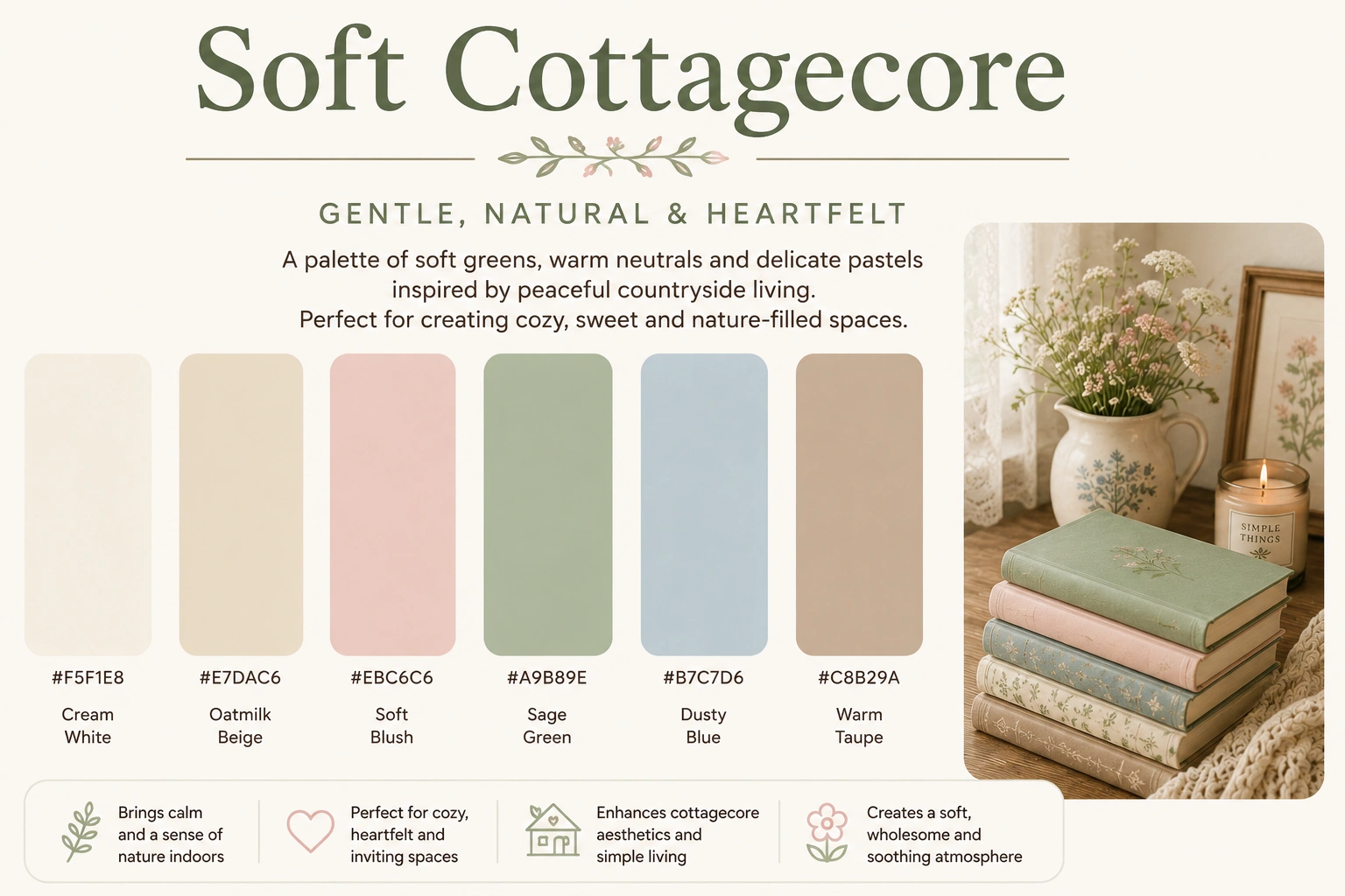
Palette Applied
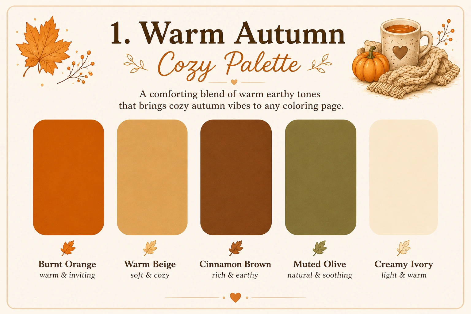
Warm Autumn
Rich oranges, golden browns, pumpkin tones, and warm fall colors. This palette is perfect for autumn leaves, candles, books, cozy drinks, blankets, and fall-inspired coloring pages.
Color Palette
Palette Applied
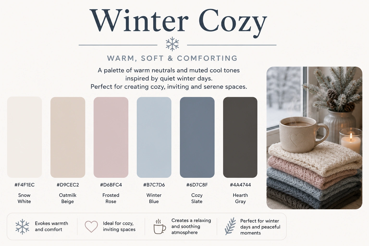
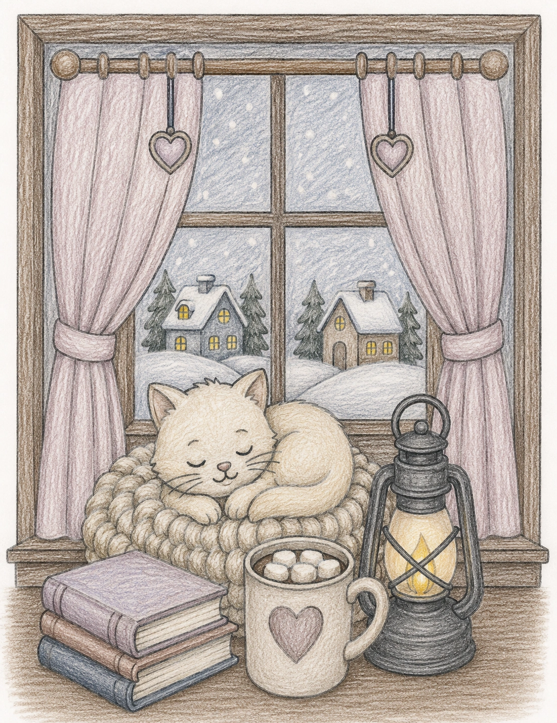
Winter Cozy
Cool grays, soft blues, smoky neutrals, and winter-inspired tones for a calm snowy feeling. Use this palette for cold windows, winter blankets, night skies, mugs, books, and peaceful cozy scenes.
Color Palette
Palette Applied
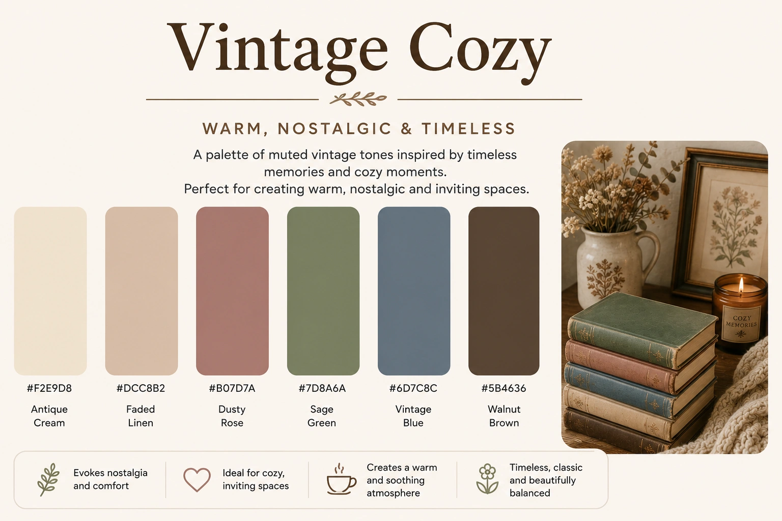
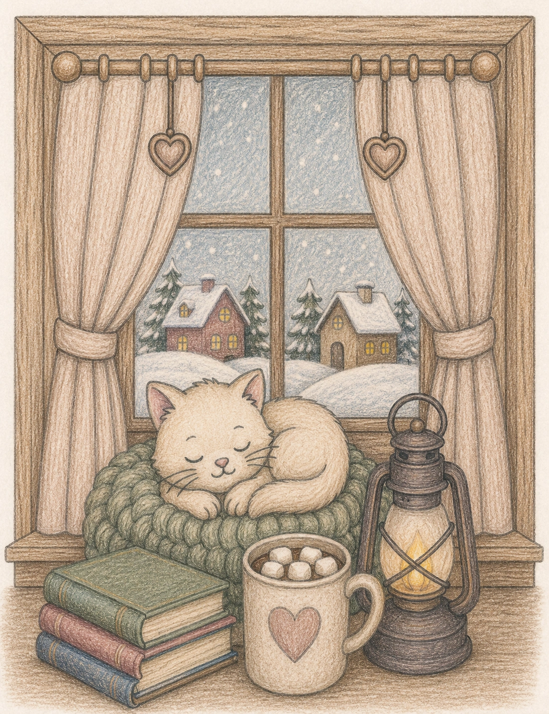
Vintage Cozy
Muted browns, faded greens, creamy neutrals, and soft vintage tones that create a nostalgic handmade look. This palette works well for old books, wood, curtains, baskets, mugs, and classic cozy interiors.
Color Palette
Palette Applied
Detailed Guide to Cozy Color Palettes for Adult Coloring Pages
While every coloring enthusiast develops personal preferences over time, certain color combinations consistently appear in some of the most popular adult coloring pages. Cozy color palettes are designed to create feelings of comfort, relaxation, warmth, and nostalgia. They work especially well in cozy coloring books featuring cats, books, rainy windows, cottages, coffee themes, seasonal scenes, and relaxing indoor environments.
The following guide explores how each palette can be used to transform the mood of a coloring page and help you create more visually balanced artwork.
Cozy Coffee Palette
Warm espresso browns, creamy beige shades, caramel accents, and soft mocha tones create one of the most popular color combinations for adult coloring pages. Inspired by coffee shops, reading corners, and cozy afternoons indoors, this palette works beautifully for books, mugs, candles, blankets, and cozy cat coloring pages. The natural contrast between dark coffee colors and lighter cream shades creates depth while maintaining a relaxing atmosphere.
Cozy Sunset Palette
Golden oranges, peach tones, warm amber colors, and subtle browns capture the feeling of sunset light. This palette is perfect for windows, evening skies, candlelit scenes, and peaceful cottage interiors. Many coloring enthusiasts use sunset-inspired colors to create warmth and visual focus without overwhelming the page with highly saturated colors.
Forest Cottage Palette
Earthy greens, moss tones, natural browns, and muted neutrals bring a peaceful woodland atmosphere to any coloring page. Forest-inspired palettes are especially popular in cottagecore coloring pages because they balance natural beauty with comfort and simplicity. These colors work well for plants, cabins, bookshelves, gardens, and outdoor scenes.
Lavender Dream Palette
Lavender, lilac, blush pink, and soft gray tones create a dreamy and relaxing visual experience. This palette is often associated with mindfulness coloring, calm evenings, flowers, journals, and peaceful bedroom scenes. The soft pastel combination helps create artwork that feels gentle, elegant, and visually harmonious.
Pastel Calm Palette
Soft pinks, pale blues, creamy whites, and subtle neutral shades are ideal for creating light and airy coloring pages. Pastel palettes are particularly popular among beginners because the colors naturally blend together and rarely clash. They work beautifully for cozy animals, clouds, flowers, and relaxing printable coloring pages.
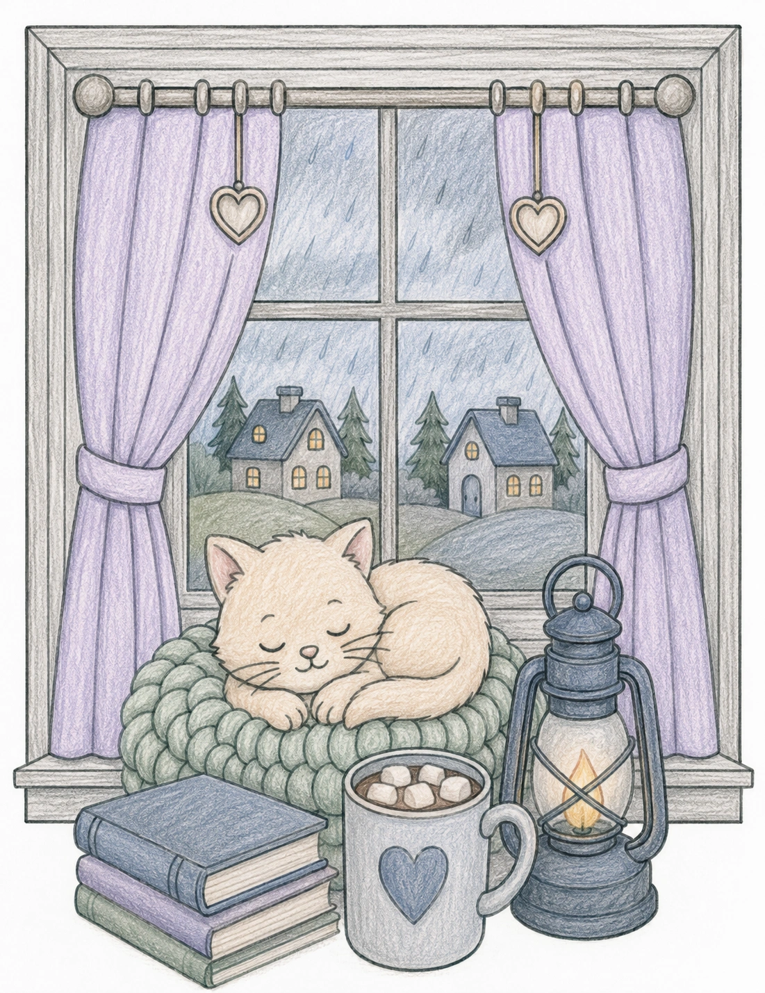
Rainy Day Palette
Muted blues, cool grays, and soft navy shades create a peaceful atmosphere inspired by rainy afternoons. This palette is excellent for window scenes, books, tea cups, blankets, and quiet indoor moments. Cooler colors help slow the visual pace of an illustration and often contribute to a more calming coloring experience.
Soft Cottagecore Palette
Creamy beige, dusty pink, muted green, and natural brown tones perfectly capture the cottagecore aesthetic. These colors are frequently used in illustrations featuring gardens, flowers, baskets, handmade decorations, and countryside cottages. The muted palette creates a timeless and comforting appearance.
Warm Autumn Palette
Pumpkin orange, golden yellow, chestnut brown, and warm amber tones are ideal for autumn coloring pages. This palette instantly creates feelings of comfort, nostalgia, and seasonal warmth. It works especially well for fall leaves, cozy drinks, candles, books, and seasonal decorations.
Winter Cozy Palette
Soft blues, cool grays, smoky neutrals, and icy accents help create peaceful winter scenes without feeling harsh or cold. These colors are excellent for snowy landscapes, winter windows, blankets, fireplaces, and nighttime illustrations. The subtle contrast creates depth while maintaining a calm atmosphere.
Vintage Cozy Palette
Faded greens, muted browns, antique creams, and nostalgic neutral tones create a timeless handmade appearance. Vintage-inspired palettes work particularly well for libraries, journals, teacups, wooden furniture, baskets, and classic cozy interiors. Many experienced colorists use these colors to make coloring pages feel more sophisticated and realistic.
What Are the Best Cozy Color Palettes for Adult Coloring Pages?
The best cozy color palettes for adult coloring pages usually combine warm neutrals, muted greens, soft blues, dusty pinks, lavender shades, creamy beige tones, and earthy browns. These colors work especially well because they create a calm, cohesive, and comforting mood without making the page feel visually overwhelming.
If you want a simple starting point, use five colors: one dominant color, two supporting colors, one light neutral, and one accent color. For example, a cozy coffee palette might use espresso brown, caramel, cream, warm beige, and a small touch of dark olive. A cottagecore palette might use sage green, dusty pink, mushroom brown, ivory, and muted lavender.
Best Colors at a Glance
This quick reference table is designed for readers who want a fast answer before choosing markers, colored pencils, or gel pens. It also helps Google understand the main relationships between color moods, palette names, and coloring page themes.
| Coloring Mood | Best Colors | Best Coloring Page Themes | Recommended Palette |
|---|---|---|---|
| Cozy and warm | Cream, beige, caramel, mocha, soft brown | Cozy cats, books, blankets, tea, fireplaces | |
| Calm and relaxing | Soft blue, sage green, lavender, pale gray | Stress relief pages, rainy windows, mindfulness coloring | |
| Cottagecore | Sage green, dusty pink, cream, mushroom brown | Cottages, flowers, gardens, baskets, baking scenes | |
| Autumn comfort | Pumpkin orange, golden yellow, chestnut, amber | Fall leaves, candles, mugs, cozy seasonal rooms | |
| Vintage and nostalgic | Olive green, antique cream, walnut brown, muted gold | Libraries, journals, book nooks, old furniture |
Colors for Relaxation and Stress Relief
Many adults choose coloring because it gives the mind a structured, screen-free activity. The page has boundaries, repeated shapes, and a clear creative task, which can make color selection feel soothing when the palette is simple and harmonious. For this reason, colors for relaxation and stress relief usually work best when they are muted, soft, and easy for the eye to follow.
Soft blues can suggest quiet skies, rainy windows, water, and slow breathing. Muted greens often feel balanced because they are associated with plants, moss, herbs, gardens, and natural spaces. Warm cream, beige, and brown tones create comfort because they appear in familiar cozy objects such as books, wooden tables, blankets, coffee, tea, and candlelight. Lavender and dusty pink shades can make a coloring page feel dreamy, gentle, and reflective.
A relaxing coloring palette does not have to be pale or boring. The key is contrast control. A page with soft blues, smoky gray, cream, and one warm amber accent can feel peaceful while still looking finished. A page with sage green, mushroom brown, ivory, and dusty rose can feel natural and comforting without becoming flat.
For stress relief coloring pages, avoid using too many highly saturated colors at once. Neon shades, intense reds, and unrelated bright colors can be beautiful in playful artwork, but they often compete for attention in cozy illustrations. If your goal is calm focus, choose colors that belong to the same visual family and repeat them across the page.
Expert Recommendations for Better Coloring Results
A practical way to make adult coloring pages look more polished is to plan the color system before coloring the main areas. Experienced colorists often create a small swatch row in the margin or on a scrap sheet of paper. This allows them to test marker saturation, pencil layering, and color harmony before committing to the finished page.
For cozy coloring pages, a five-color formula works especially well: one dominant color, two supporting colors, one neutral, and one accent. The dominant color establishes the atmosphere. Supporting colors add variety. The neutral gives the eye a place to rest. The accent color should be used sparingly on focal points such as a candle flame, a teacup, a flower center, a book cover, or a small decorative object.
Another useful technique is repeating the same colors in different parts of the illustration. If you use dusty pink on a pillow, repeat a smaller amount of dusty pink on flowers, curtains, or a book spine. This repetition creates unity and makes the page feel intentional.
When using colored pencils, layer lightly and build depth gradually. When using alcohol markers, test combinations first because markers often dry slightly different from how they appear when wet. When using gel pens, reserve them for small accents so the page stays cozy rather than overly shiny.
How to Build a Cozy Color Palette Step by Step
Follow this simple framework to create harmonious color combinations for cozy coloring pages, cottagecore scenes, rainy-day illustrations, book nooks, and relaxing adult coloring books.
Choose the Mood
Start by deciding how you want the coloring page to feel: cozy, relaxing, nostalgic, dreamy, or seasonal.
Pick a Dominant Color
Select one main color that will appear throughout the page and establish the overall atmosphere.
Add Supporting Colors
Choose two colors that complement the dominant color and reinforce the visual mood.
Choose an Accent Color
Add a small amount of contrast to guide the eye toward focal points.
Test Before Coloring
Create a quick swatch to ensure the palette feels balanced and cohesive before applying it to the entire illustration.
Example Cozy Palette Formula
A simple Cozy Coffee palette using one dominant color, two supporting colors, and one accent color.
Color Combinations for Coloring Pages That Always Work
Some color combinations are especially reliable for adult coloring pages because they balance warmth, contrast, and softness. These combinations are useful when you want a finished page to look cohesive without spending too much time planning.
| Combination | Visual Effect | Use It For |
|---|---|---|
| Brown + cream + caramel | Warm, cozy, coffee-inspired | Cats, mugs, blankets, wooden furniture |
| Sage green + dusty pink + ivory | Soft cottagecore | Flowers, cottages, gardens, baskets |
| Muted blue + warm beige + amber | Rainy but comforting | Windows, reading nooks, tea scenes |
| Lavender + blush + soft gray | Dreamy and peaceful | Bedrooms, journals, floral pages |
| Olive + walnut + antique cream | Vintage and nostalgic | Libraries, book covers, old desks |
These combinations are also useful for planning future printable products. If you are coloring multiple pages from the same cozy coloring book, repeating a few related palettes can make the collection feel more professional and visually consistent.
Best Palettes by Coloring Page Theme
Cozy cat coloring pages
Cozy cat coloring pages work beautifully with cream, caramel, mocha, soft brown, warm gray, and amber. These colors support scenes with books, blankets, coffee cups, candles, pillows, and rainy windows. A small accent such as olive green or muted blue can keep the page from looking too monochrome.
Cottagecore coloring pages
Cottagecore coloring pages usually look best with sage green, dusty rose, mushroom brown, warm cream, lavender, and faded yellow. These colors match gardens, cottages, flowers, baskets, teapots, and slow living illustrations. They also support a handmade, nostalgic mood.
Book nook and reading coloring pages
Reading-themed pages benefit from vintage cozy palettes. Use antique cream for paper, walnut brown for shelves, olive green for book covers, amber for lamps, and muted blue or gray for windows. This creates a library atmosphere that feels warm and quiet.
Autumn coloring pages
Autumn pages are ideal for pumpkin orange, golden yellow, chestnut, terracotta, deep red, and warm beige. These colors are especially effective for leaves, mugs, scarves, candles, pumpkins, and cozy rooms.
Rainy-day coloring pages
Rainy-day pages need a balance of cool and warm colors. Use muted blue and soft gray outside the window, then add cream, brown, or amber inside the room. This contrast makes the indoor space feel even cozier.
Printable Color Palette Chart Guide
A printable color palette chart is a simple reference sheet where you can record your favorite color combinations. It can include palette names, color swatches, pencil numbers, marker names, HEX codes, and notes about which coloring themes each palette works best with.
For adult coloring pages, a useful palette chart should include space for at least five colors per palette: dominant color, support color one, support color two, neutral color, and accent color. This structure makes it easier to reuse successful combinations later.
If you print a cozy palette chart, try creating separate rows for Cozy Coffee, Soft Cottagecore, Rainy Day, Warm Autumn, Winter Cozy, and Vintage Cozy. Then test each palette on a small version of the same coloring page. Seeing the same illustration colored in different ways makes it much easier to understand how color changes mood.
Common Mistakes When Choosing Coloring Page Colors
The most common mistake is using too many unrelated colors on one page. This can make even a beautiful illustration feel scattered. Another mistake is using only dark colors without enough cream, beige, pale gray, or white space to balance the composition.
A third mistake is ignoring the theme of the artwork. A cozy library page usually needs different colors than a spring cottage garden or a winter window scene. Matching the palette to the theme helps the final page feel more intentional.
Finally, many beginners forget to repeat colors. Repetition is one of the simplest ways to create harmony. If a color appears only once, it may look accidental. If it appears in three or four small places, it becomes part of the visual language of the page.
Continue Building Your Relaxing Coloring Routine
Color palettes are only one part of a relaxing creative practice. If you want more ideas, start with 25 cozy coloring page ideas for adults to choose themes, then explore coloring techniques for stress and anxiety for calmer coloring habits. You can also read Mindfulness Coloring for Adults if you want a slower, more present coloring routine, or browse relaxing coloring pages for adults for more printable inspiration.
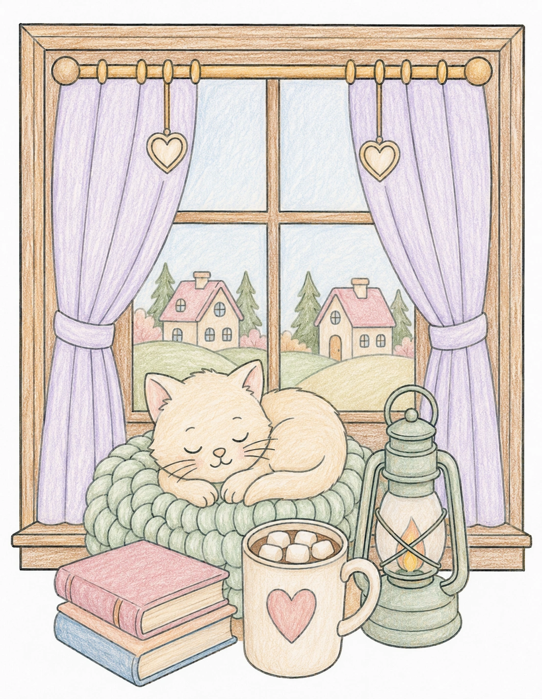
Which Cozy Palette Would You Choose?
Every color palette completely transforms the mood of the same coloring page. Warm autumn tones feel nostalgic and comforting, while soft pastel shades create a peaceful dreamy atmosphere.
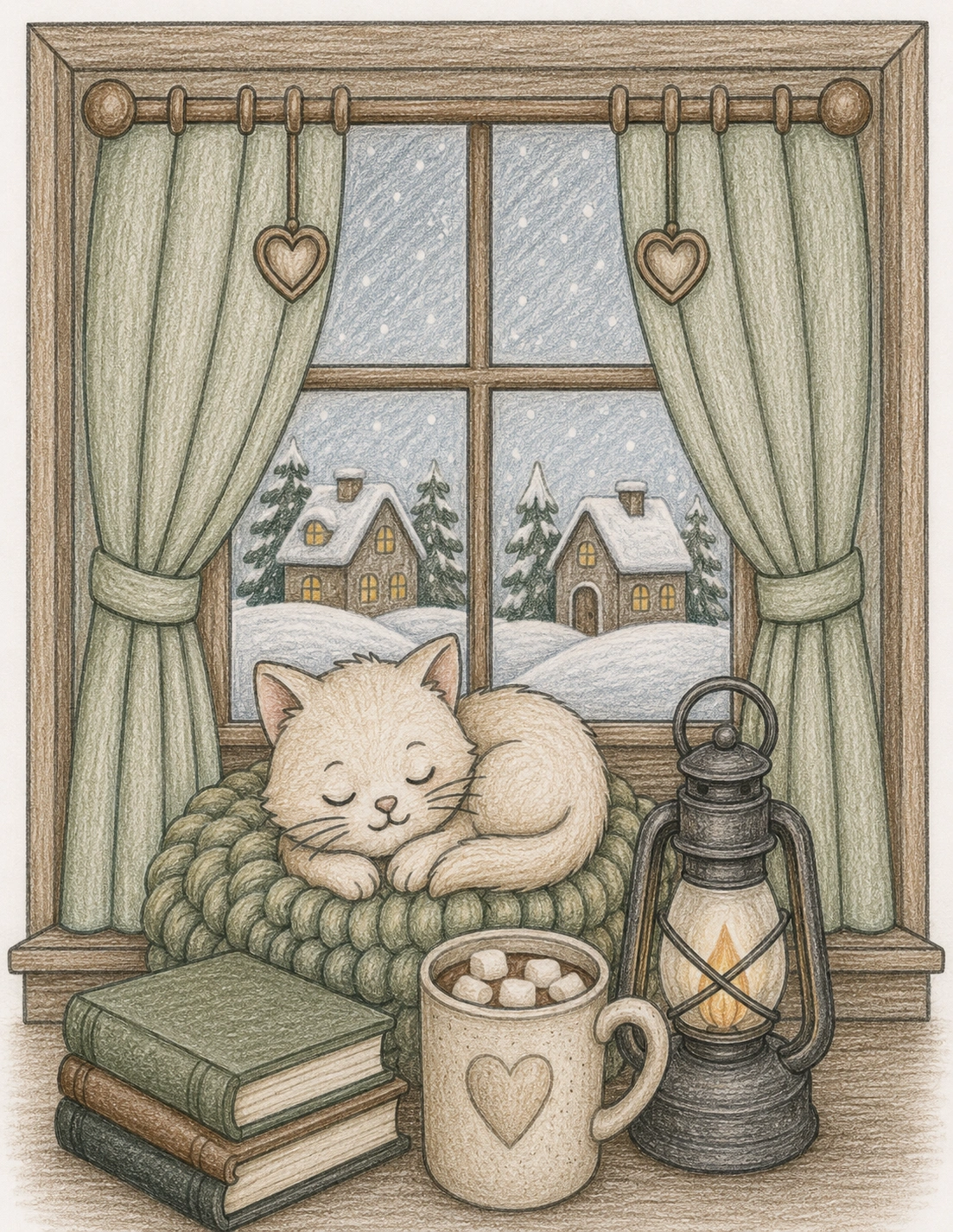
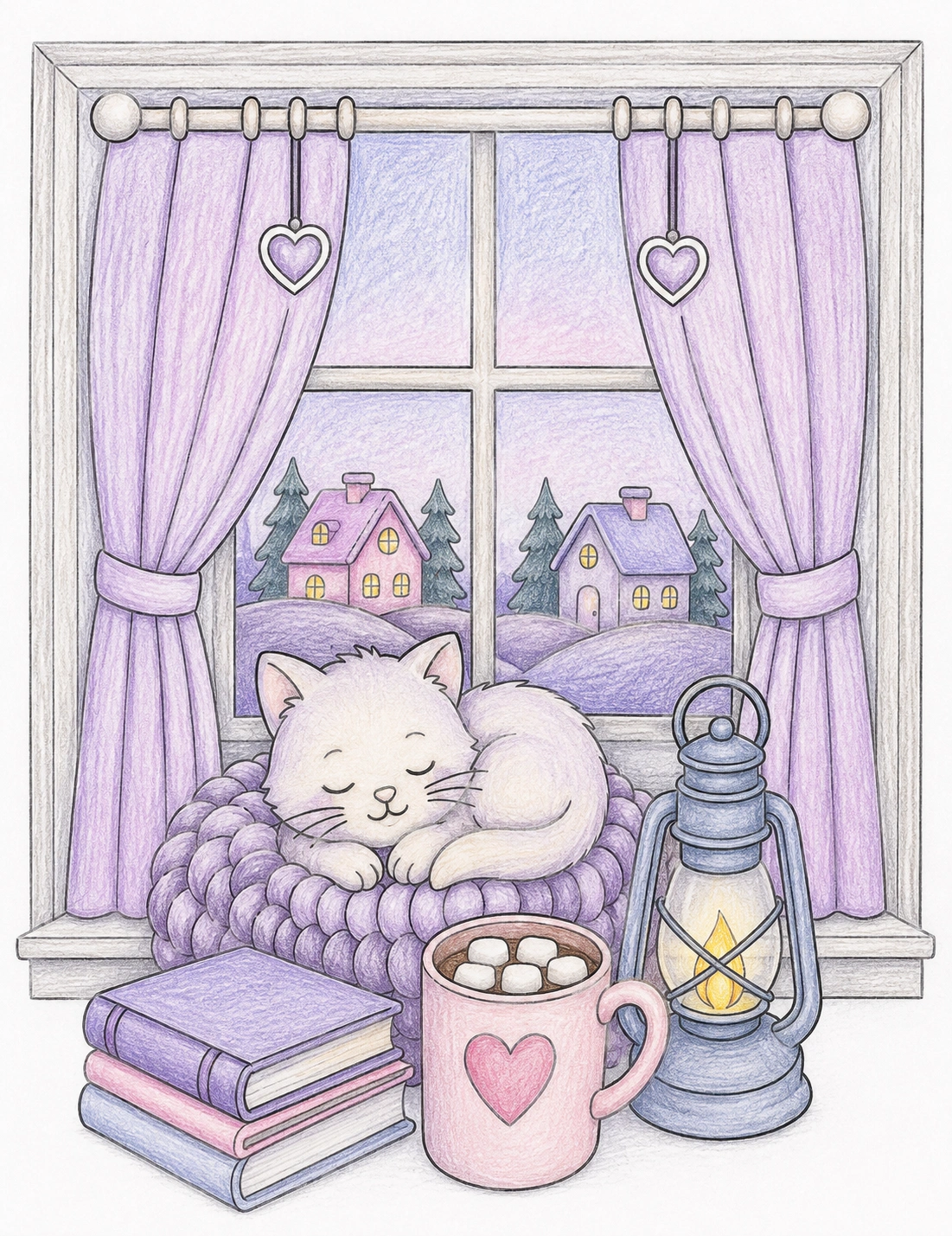
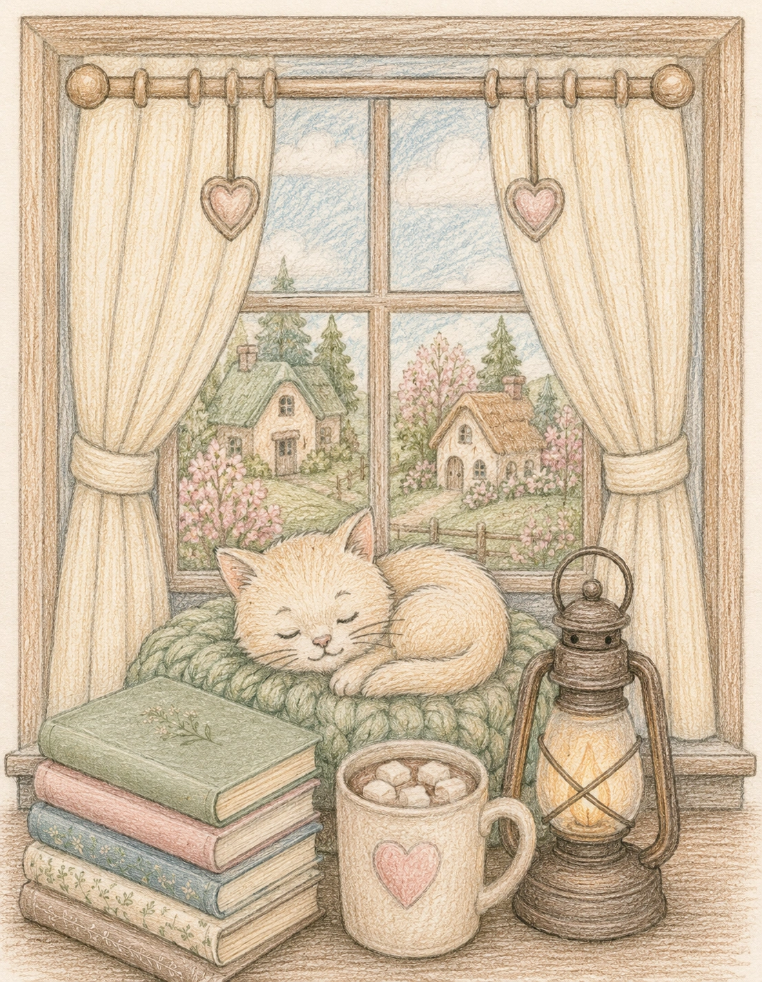
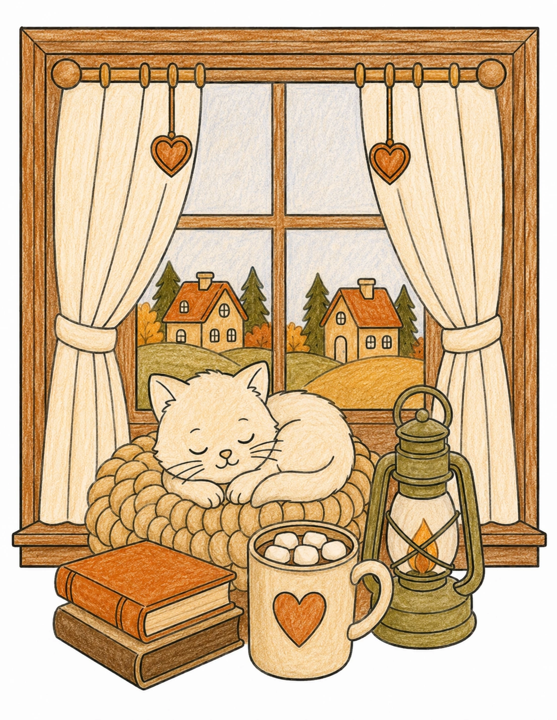
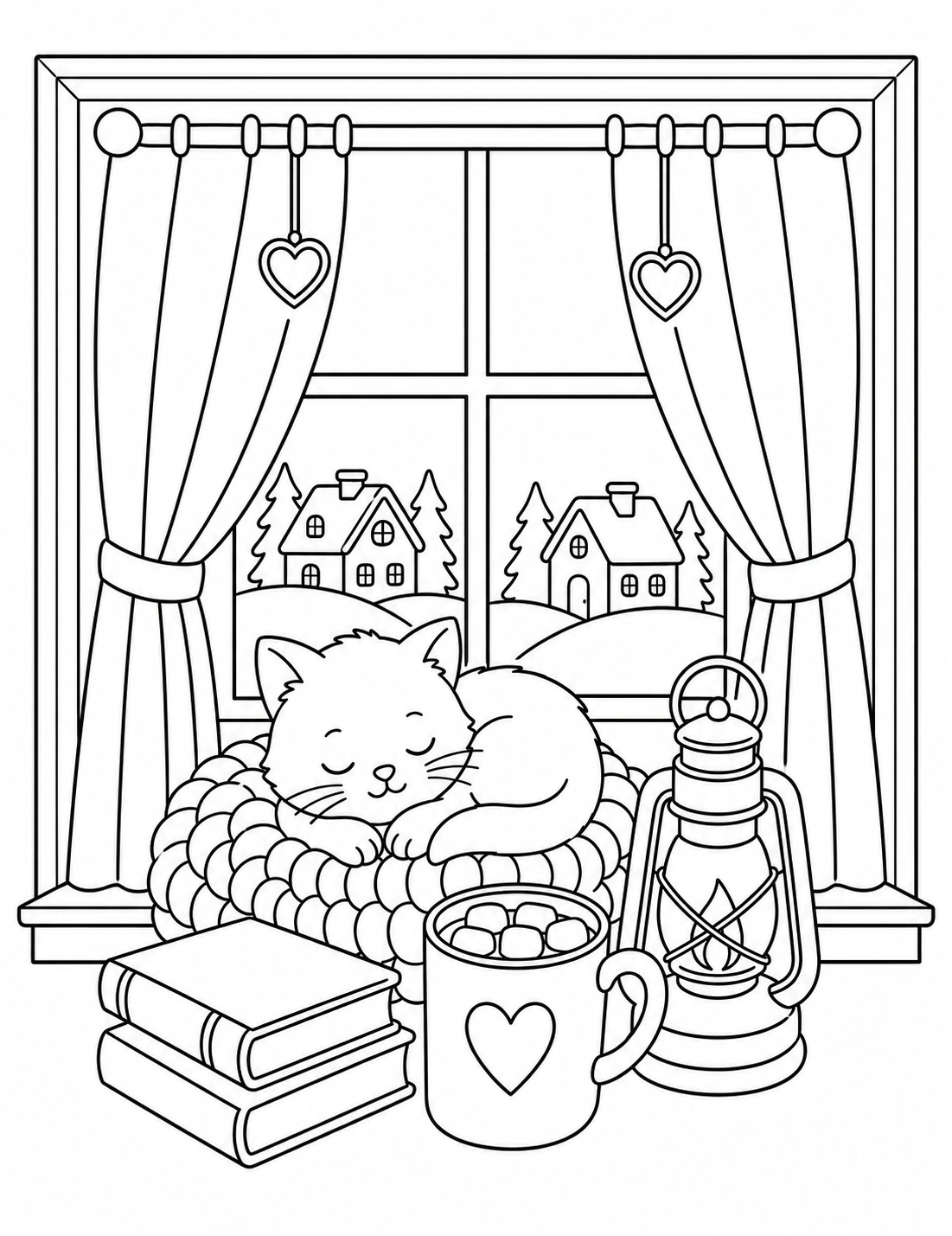
Download the original cozy kitten coloring page and experiment with all 10 palettes to discover your favorite cozy aesthetic. Try cottagecore colors, rainy-day blues, warm coffee tones, lavender shades, and soft vintage combinations.
Sometimes the most relaxing part of coloring is simply exploring which colors make you feel calm, cozy, and inspired.
Frequently Asked Questions About Cozy Color Palettes
What are cozy color palettes?
Cozy color palettes are soft, warm, calming, or nostalgic color combinations designed to create a comforting visual atmosphere in coloring pages.
Which colors are best for relaxing coloring pages?
Warm neutrals, muted greens, dusty pinks, lavender tones, soft blues, earthy browns, and creamy beige shades are commonly used in relaxing cozy coloring palettes.
Can color palettes affect mood while coloring?
Many people feel that calming color combinations help create a more peaceful and mindful coloring experience, especially during stressful or overwhelming periods.
What colors make a coloring page look cozy?
Cream, beige, caramel, mocha brown, sage green, dusty pink, muted lavender, warm gray, and amber can make a coloring page feel cozy and inviting.
How many colors should I use on one adult coloring page?
Five or six main colors are usually enough for a balanced adult coloring page. A limited palette helps the finished artwork look cohesive instead of visually crowded.
What is the best color palette for cottagecore coloring pages?
Sage green, dusty pink, warm cream, mushroom brown, muted lavender, and faded yellow are excellent choices for cottagecore coloring pages.
What is the best color palette for cozy cat coloring pages?
Cozy Coffee is one of the best palettes for cozy cat coloring pages because cream, caramel, mocha, beige, and warm brown work well with books, blankets, mugs, and indoor scenes.
What colors are best for stress relief coloring pages?
Soft blue, sage green, muted lavender, warm beige, pale gray, and gentle earth tones are often used for stress relief coloring pages because they create a calmer visual effect.
Are warm colors or cool colors better for relaxing coloring?
Both can work. Warm colors create comfort and coziness, while cool colors create calm and quiet. The most relaxing palettes often combine both, such as muted blue with warm beige.
What colors create a vintage coloring style?
Antique cream, olive green, walnut brown, muted gold, faded rose, and smoky blue can create a vintage or nostalgic coloring style.
Should beginners use color palettes?
Yes. Beginners often get better results with palettes because they reduce guesswork, prevent clashing colors, and make the page easier to finish.
What supplies work best for cozy color palettes?
Colored pencils, alcohol markers, brush markers, and gel pens can all work well. Colored pencils are especially useful for soft layering, while markers are helpful for smooth, bold areas.

